I have been pointing out how the number of new households has been growing much faster than the number of new homes coming on the market for years.
But, I rarely share charts that illuminate the situation as clearly as the two charts I am sharing below.
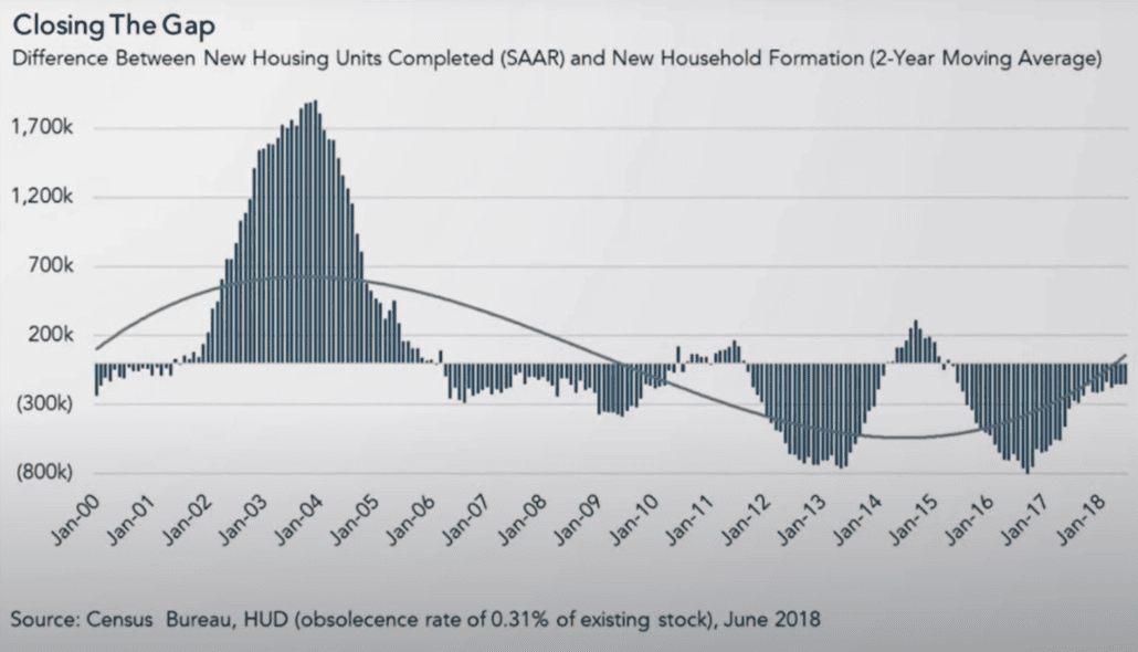
What is so telling for both charts is how the supply of homes shot through the roof relative to both population and new household formations, prior to the 2008 meltdown.
These charts are extremely valuable evidence to present to anyone who believes we might see a repeat of a 2008-style housing correction.
Builders stopped building lower-end homes in particular because they got burned in 2008 from overbuilding in response to artificial demand (speculators with easy financing), and because high development costs have made doing so unprofitable.
Long story short: Today’s record low inventory levels (600,000ish vs. 4.1 million in 2007) are not just a result of mortgage rate lockdowns and high interest rates. They are also a result of a huge disparity between new housing units built vs. population and household growth. Today’s conditions are markedly different from 2008’s – once again.
Difference between New Housing Units Completed and New Household Formation (borrowed from this NREP video: Why Are We Not Building Houses)
Home Supply vs. Population Has Been Dwindling for 16 Years